http://georgiaagibbs7.wix.com/thekid
This is the link to the official website of 'The Kid' film. I decided to produce this as in modern day society, multi media productions are very important for promotion and advertising. I decided this would be a good idea as people can have all the information about the film in one place, including cast/crew list and information, information on the film, background of the film, the narrative outline as well as other medias including the trailer, video evidence and the film poster.
I decided to keep the website simple and not to busy as I felt this would take away from the genre as well as distracting/putting people off viewing the website. I kept a simple colour scheme of black, grey and red this goes into the three colour rule. These colours also reflect the genre well as red connotes danger and gore, black and grey connote death and mystery which are perfect for 'The Kid'.
I done some research into movie websites, these were 'gone girl,' 'se7en' and 'Krampus' all of which helped me in ideas and producing my own website. It showed me conventions which every website have as well as colour schemes and ideas for the information to include. This was to maximise the appeal to the target demographic.
Above is evidence of the website I have created to show I have used original images and ideas. However, after feedback on this home page I have changed the image to the official trailer as shown below, this is so that as soon as the website is opened the trailer commences hooking in the audience straight away. This sells the product and film immediately to the audience. However, I have kept the colour scheme for the background and the same headings.
Below is part of the home page and shows the development of the production taking place via photos. This is something that after feedback I have edited and changed to make it look more professional. A common question was "what are the dates supposed mean?" and this is not something I am capable of answering to all audiences and therefore I have changed and taken out the dates so there is no confusion. Also, the left hand photo does not flow with the other two images as it has a second person present taking away the focus on the main character so I have chosen an image much more similar to these two to add in. Below the images I felt that 'In the news' and 'Development' were not really for the homepage so I have changed this to the social networking links to reflect intertextuality as well as including two interviews from the director and the main character. Evidence of this is shown below, showing the changes to the dates, images and links/ interviews.
I have added some information about the trailer here to outline the narrative, genre, cast and release dates. This allows the audience to understand the narrative in more detail as well as receiving some more information on the film, release date and extra information around the film.
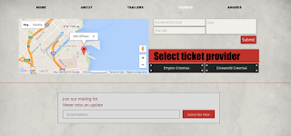
I decided to add direct links to cinema pages where people can buy tickets from with a map to show where the nearest empire/cineworld cinema may be.
Below I have put an option for audiences to place their email in to get updates about the website and film.


